This UX Design case study documents the processes involved in a redesign of a restaurant's website, Sqirl LA. The goal was to enhance a checkout flow when buying the restaurants signature jam from their website. This design sprint took 10-days to complete and was submitted to the UXDI course at General Assembly, Los Angeles.
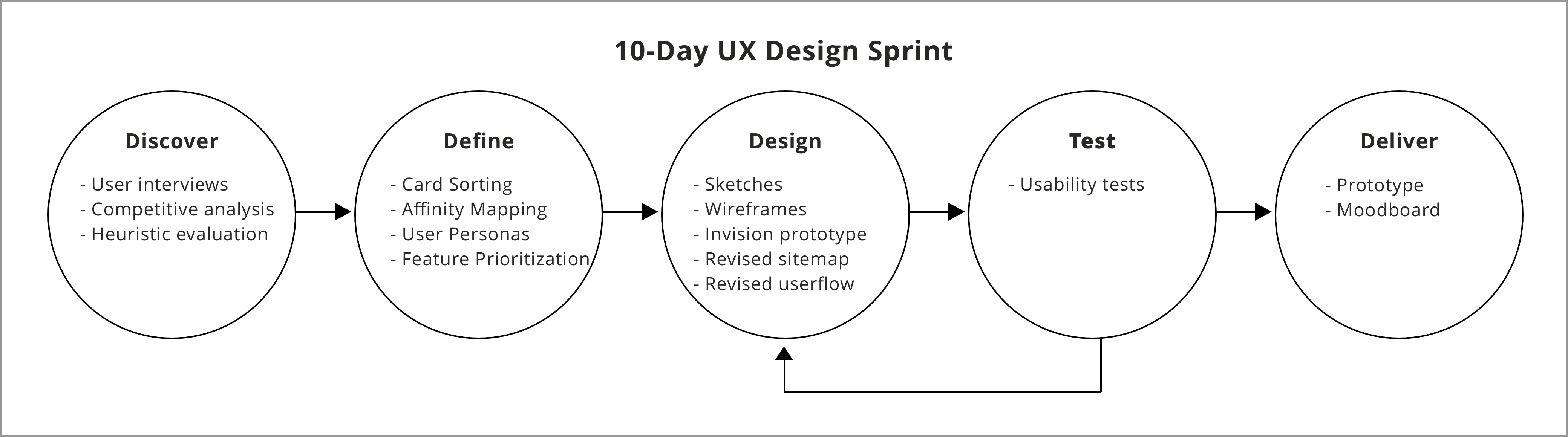
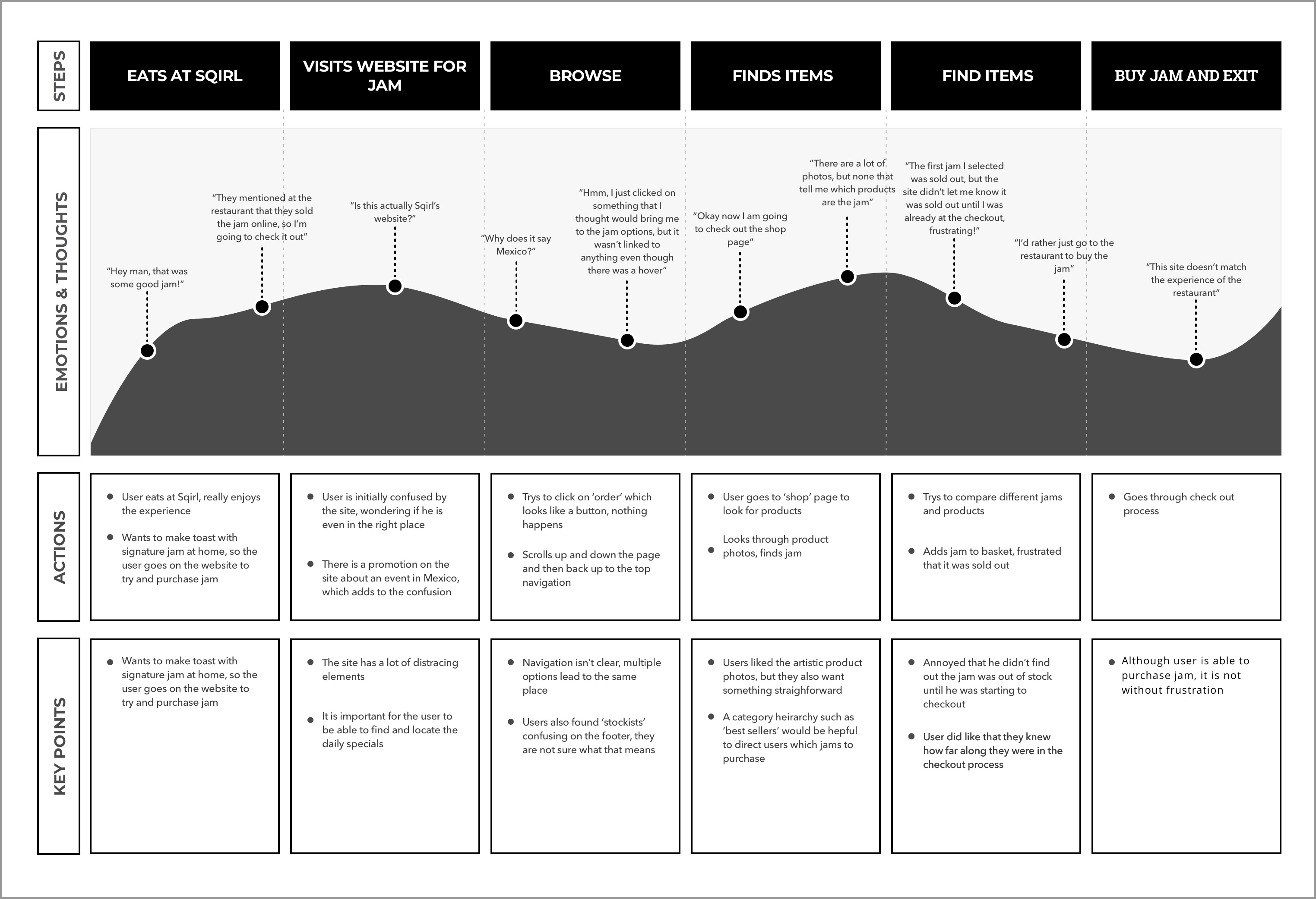
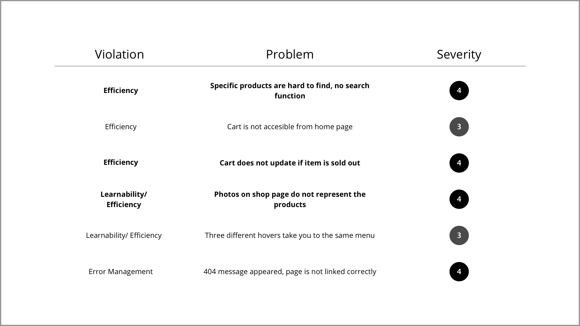
First I started by analyzing the existing website to identify key problems and issues. I measured the sites usability with Jacob Nielsens LEMERS scale. For each problem I found, I applied a level of severity and identified the type of violation.
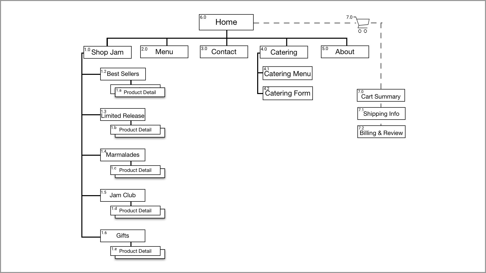
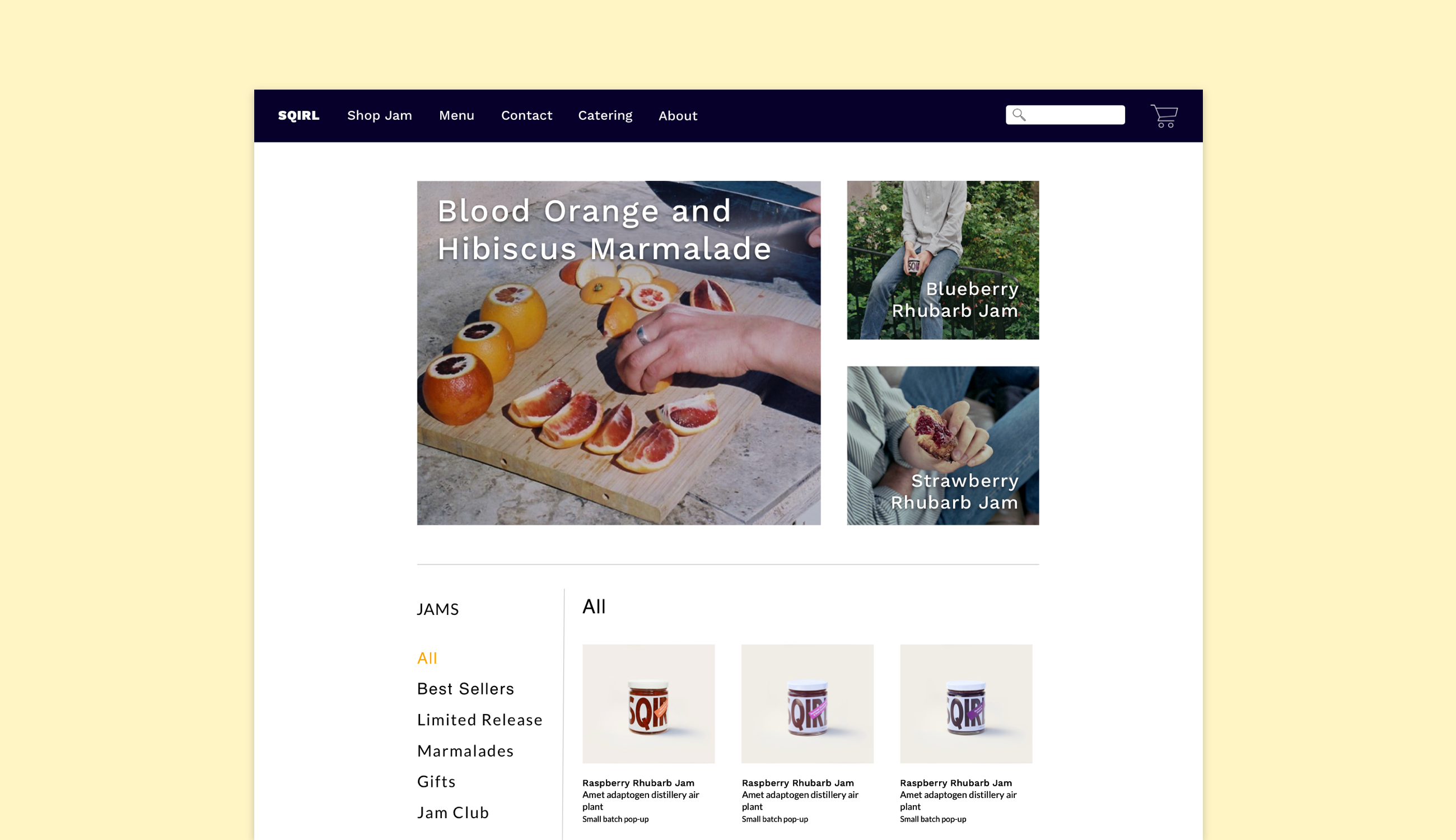
1. Specific products were hard to find, there was no search feature.
2. Cart does not update if an item is sold out.
3. Photos on the shop page do not represent the products, which users found misleading.
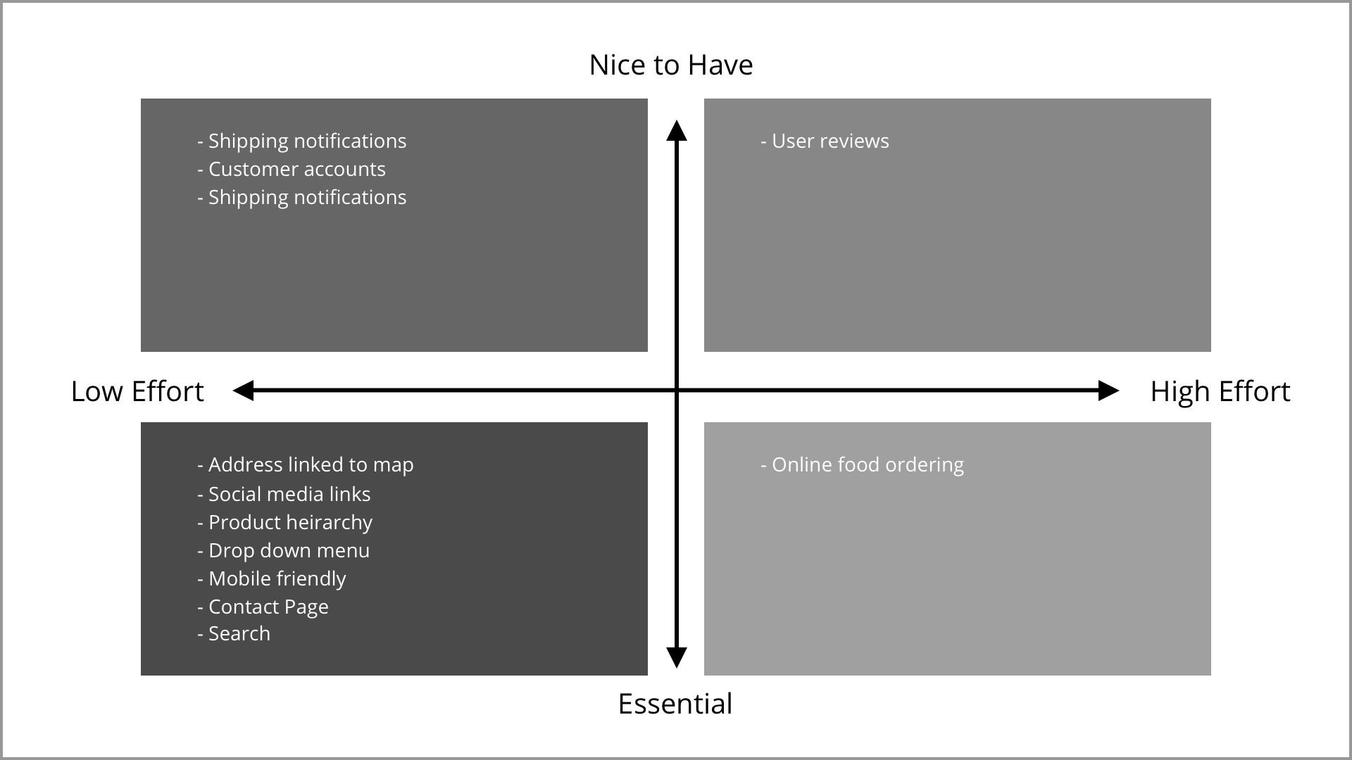
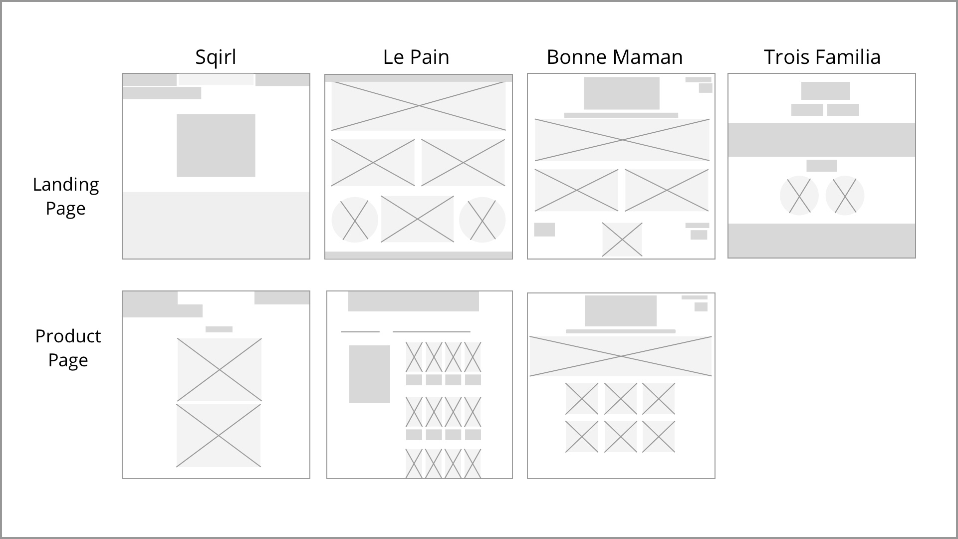
I did a comparative analysis on Sqirl’s competitors, focusing on features and layout. I looked for competitors that were both restaurants and jam sellers. Le Pain is the most direct competitor for jam, as it sells a signature jam and it is a known restaurant. Trois Familia is a restaurant in the same area as Sqirl, they have a similar target audience. Bonne Maman strictly sells jam, B2B and B2C.
Sqirl's site is lacking most of the features that their competitors offered. Le pain offered all features that were compared and has a seamless check out process. Trois Familia lacked some features, however they do not sell products online. It is important that they are included in the mix because they have a user friendly website with easy access to restaurant information.
Key quotes from users:
“Is this actually Sqirl’s website?”
“I’d rather just go to the restaurant to buy the jam”
“The site doesn’t match the experience of the restaurant”