
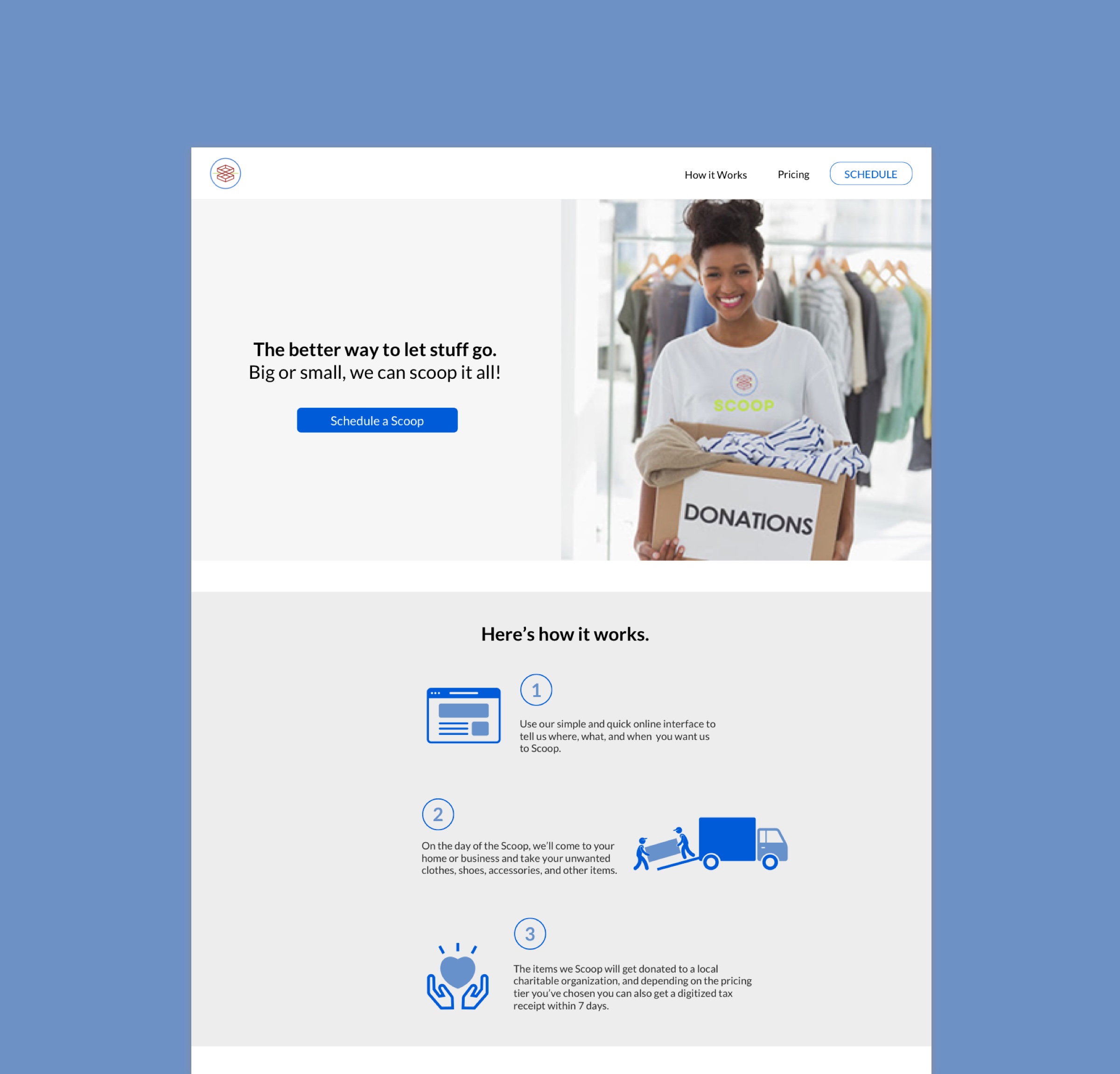
Scoop is an on demand service that helps people get rid of unwanted items in an environmentally friendly way.
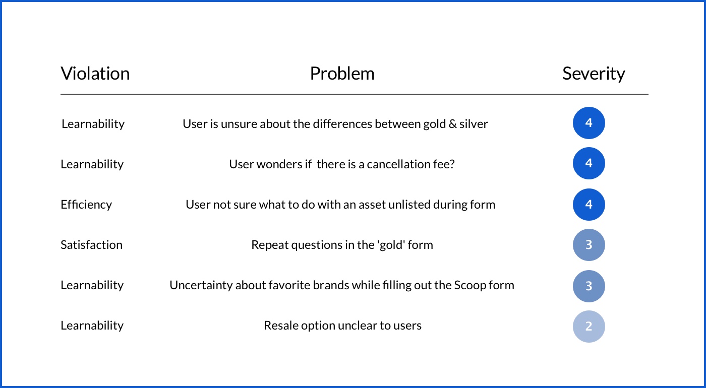
My team and I conducted a heuristic evaluation to identify possible usability issues on Scoop's website. Users initially thought they understood how Scoop worked, but as they tried to schedule a pickup they found the process daunting and were left with unanswered questions.
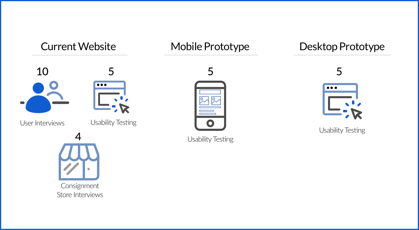
To start conducting user research we reached out to current and potential customers provided by Scoop, spoke with individuals that could benefit from a service like Scoop, distributed an online survey, and performed usability tests of the current Scoop website. W collected data on users’ thoughts, habits, and circumstances regarding donating old, unused items, as well as gathering feedback on the process on the current website.
Scoop users want to do something good with their unwanted items, but the current website feels like more work than they are willing to do.
How might we reduce the friction of using Scoop’s website?
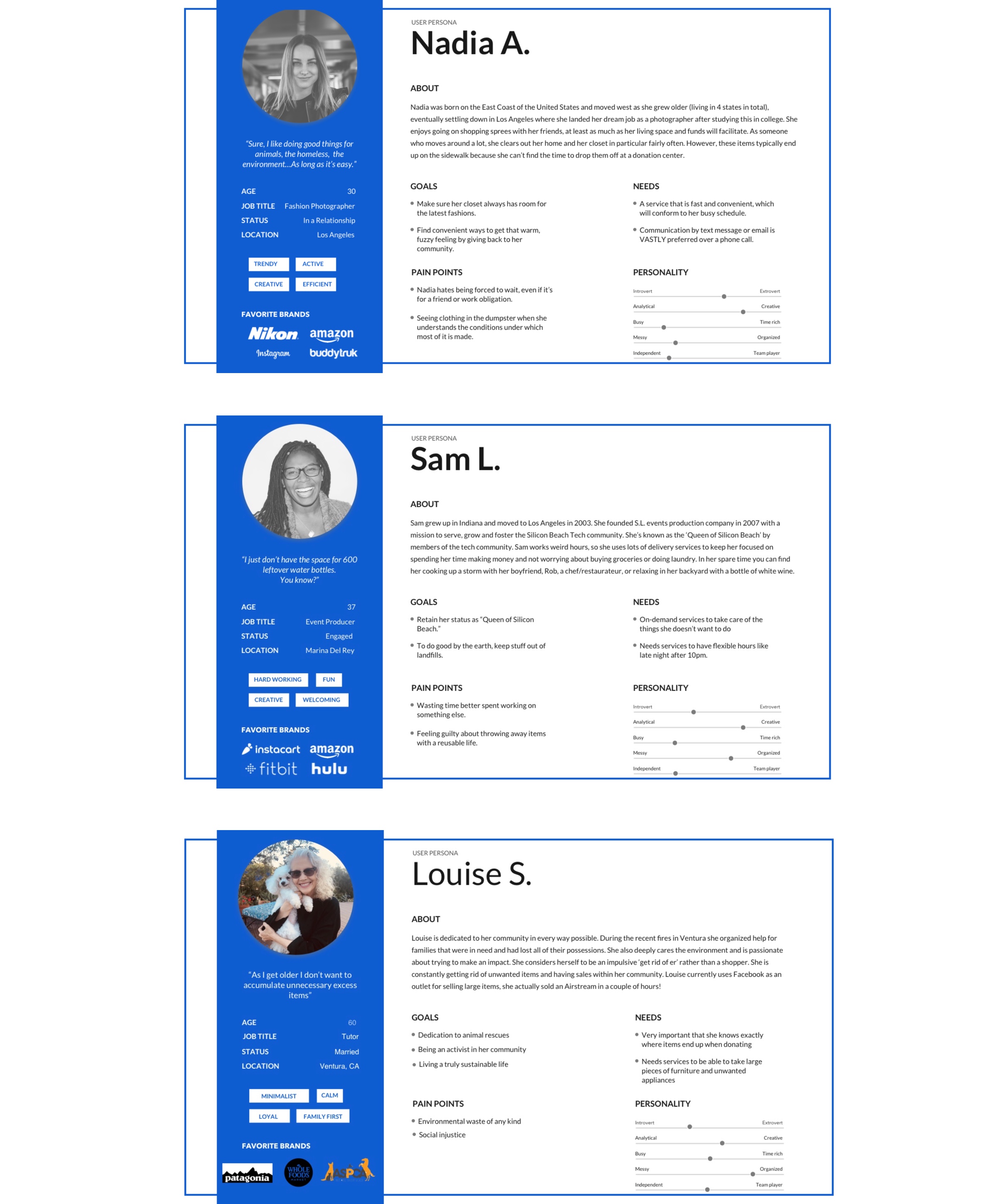
Now that we had conducted user research and crafted personas we began to ideate design concepts. As we worked through possible flows we consistently referenced our personas to make sure we were staying on track with user needs and wants.
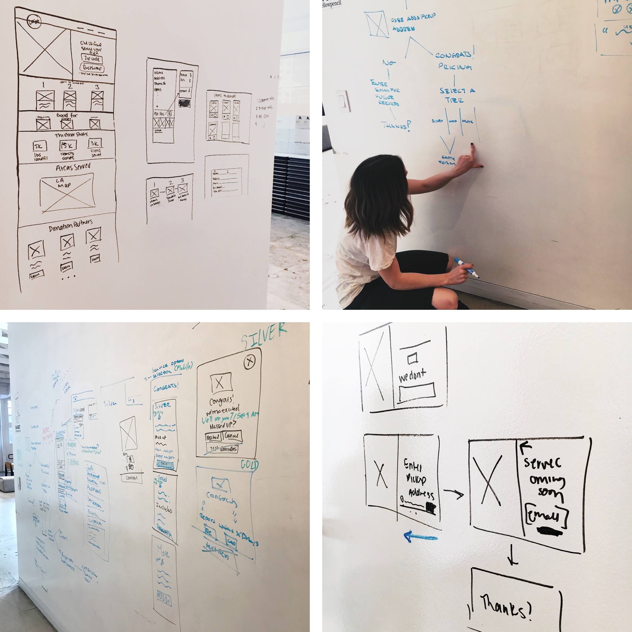
1. Tested with paper and digital wireframes
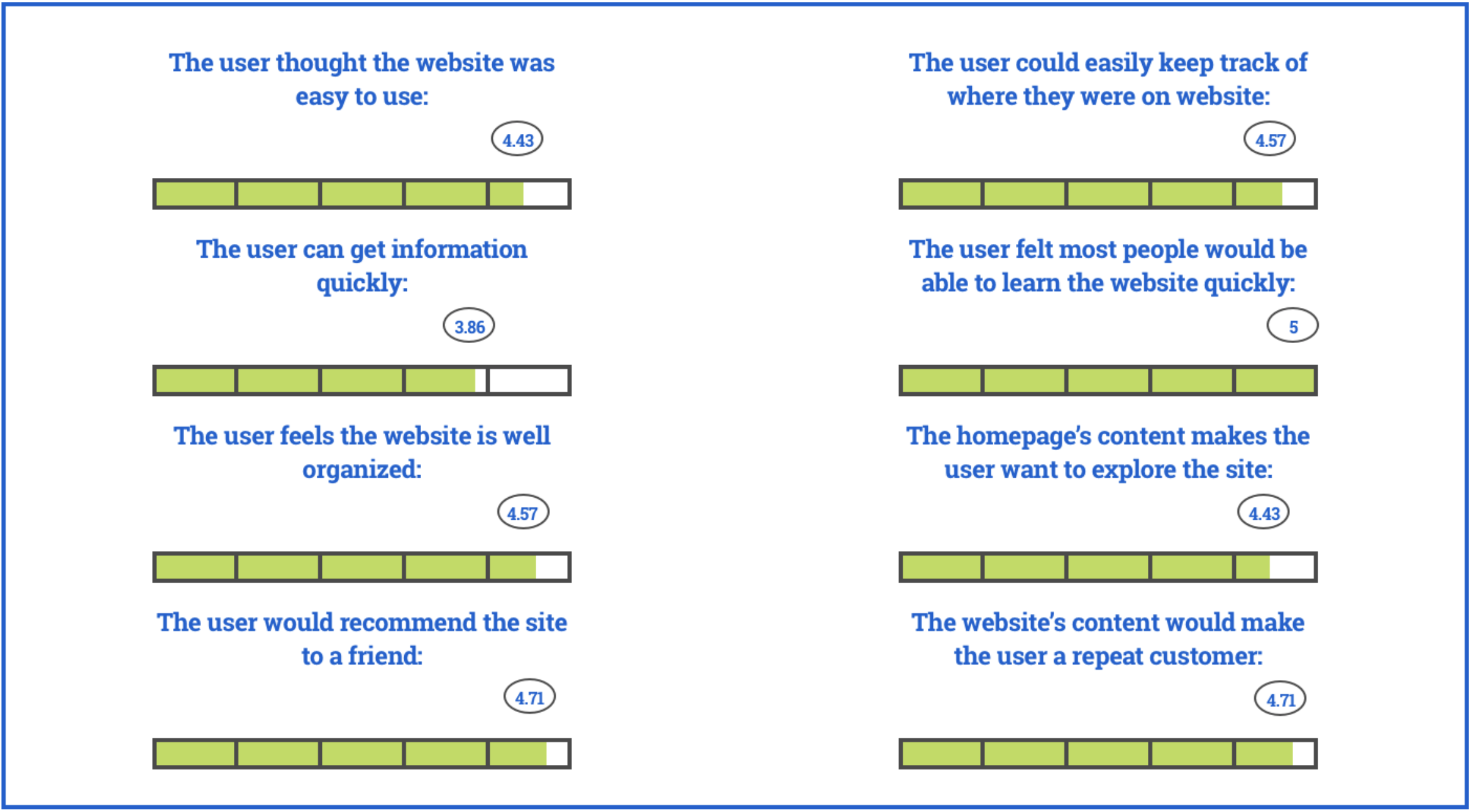
2. 100% task completion rate
3. Quantitatively measured heuristics on a 1-5 scale
The pricing model continues to be a point of confusion for users. This needs to be better defined by Scoop so users know exactly what they are paying for, and how the price is being determined. This is a service people will gladly pay for; they just need to understand the what and the why.
1. Better defined pricing model.
2. Take all screens to high fidelity using the provided materials.
3. Continue to iterate on the website using UX Design methodologies.